
2016's Top Visualizations of Inequality and Equity
Cristina Garmendia
16 January 2017
Equity is not just an ideal to admire. It can be defined, measured, and mapped.
Visualizations are an increasingly important medium to communicate our values in a digital era. We have compiled some of the best visualizations that came our way this past year that featured measures of inequality and equity. We commend the researchers and institutions for their commitment and investment to this work.
Database: CoreData.NYC

Originally launched as the Subsidized Housing Information Project (SHIP) in 2011, the NYU Furman Center relaunched CoreData.nyc in November 2016 with additional data and interactive functionality. Researchers have compiled, standardized, and mapped over 20 datasets and 100 indicators on New York City’s housing and neighborhoods. Unique for a publicly available database, it includes property-level housing subsidy information, given context by neighborhood-level information on housing markets, home affordability, land use, demographics, and neighborhood conditions. Unlike some other visualizations we've highlighted, users can not only create maps or download graphics, they can also download the source data in table format.
Report: A Vision for Equitable DC

The Urban Institute produced the report A Vision for Equitable DC to visualize the many inequities present in DC, one of the country's most segregated cities. What we especially liked here at CLiME was the feature to toggle between scenarios "reality" and "With racial equity," demonstrating what an equitable DC would look like for its black and Hispanic residents on topics like poverty status to educational attainment. According to lead researcher Leah Hendey, this project required 650 staff hours by the Urban Institute to create.
Charts: National Equity Atlas
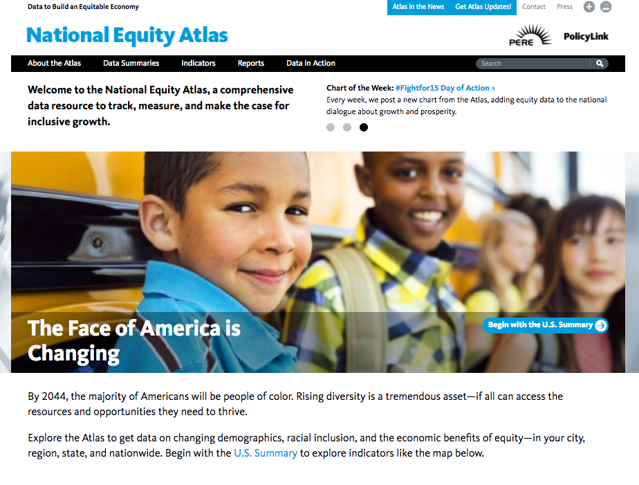

The National Equity Atlas is produced by PolicyLink and University of Southern California's Program for Environmental and Regional Equity. First launched in 2014, it provides data summaries, charts, graphs, and maps visualizing measures of equity across the country. In 2016, they continued to refine the data and analyses available by racial subgroup and geography. In addition to all 50 states and the country as a whole, the atlas covers the largest 100 cities and150 regions. This year, they added neighborhood-level data for a handful of measures, including race/ethnicity composition, people of color, unemployment, and "disconnected youth." Disconnected youth are 16 to 19-year-olds who are neither working nor in school.
You can download image files of the visualizations created by the National Equity Atlas but they do not offer the public the ability to download the underlying data.

One of the most interesting feature they added this year was its "People of Color" dynamic mapping tool, which allows you to filter counties by concentration of various minority groups. In the example below, I have asked their database for counties that are >33% black in 2010. The tool also includes years 2020, 2030, and 2040 so you can see forecasts for the rapid demographic change that is predicted for our country in the coming decades.
Historical Maps: Mapping Inequality

Mapping Inequality has digitized the historical maps commissioned by the mortgage industry that are the origin of "redlining." Between 1935 and 1940, the Home Owner's Loan Corporation commissioned maps in 250 cities that color-coded the risk and credit-worthiness of different neighborhoods based in large part on its racial composition.
Mapping Inequality was produced through a collaborative effort by University of Richmond's Digital Scholarship Lab, the Digital Curation Innovation Center at University of Maryland's College of Information Studies, and scholars from UC-Irvine, UNC-Chapel Hill, Duke, and Virginia Tech.
Digital Storytelling: Newest Americans

Storytelling is the oldest form of data visualization, and remains one of the most compelling ways to drive people towards action to rectify the inequality we see in the world.
The Newest Americans project is focused on experimenting with hyper-local storytelling methods (film, photography, and audio) around the issue of migration and changing demographics. It is produced by the Center for Migration and the Global City, and faculty in the Department of Arts, Culture and Media at Rutgers University Newark in partnership with VII Photo and Talking Eyes Media.